OXY BLUE - Positioning A Promising Brand
Any product in any
segment of the industry requires to be turned into a brand. At Qurious Design,
we believe the company manufactures a product which is transformed insight-fully into a brand by the ad agency. Of course, various aspects go into making a
brand. It is a combination of insights, design, words and creative minds that
makes the transformation successful.
THE CHALLENGE
For Oxy Blue, Packaged
Drinking Water, our team took into consideration diverse aspects prior to designing its brand identity. The local
market in the Pune region is highly unorganized given the packaged drinking
water segment. Moreover, the presence of many big and small players in this
segment makes the competition tougher. Quality of their water is poor to the
extent of being hazardous containing several impurities. In such a scenario,
introducing yet another packaged drinking water brand would mean all the same.
THE INSIGHTS
Our team studied various
local packaged drinking water brands along with some top ones. We analyzed the
pros and cons of each separately. This brand enabled us to design a brand
identity with most of the design flaws ironed out that hampers the brand
visibility in the market.
BRAND IDENTITY AND BRAND STRATEGY
For packaged drinking
water, the first impression is important. Owing to space restraint on the\ bottle
and myriad copy mandatory to be incorporated, the brand identity had to be
prominent. Our design team religiously followed this mantra while working on
the same. So our brand strategy was two-pronged with part one being the visual
identity of Oxy Blue and part two being the brand promise or the brand
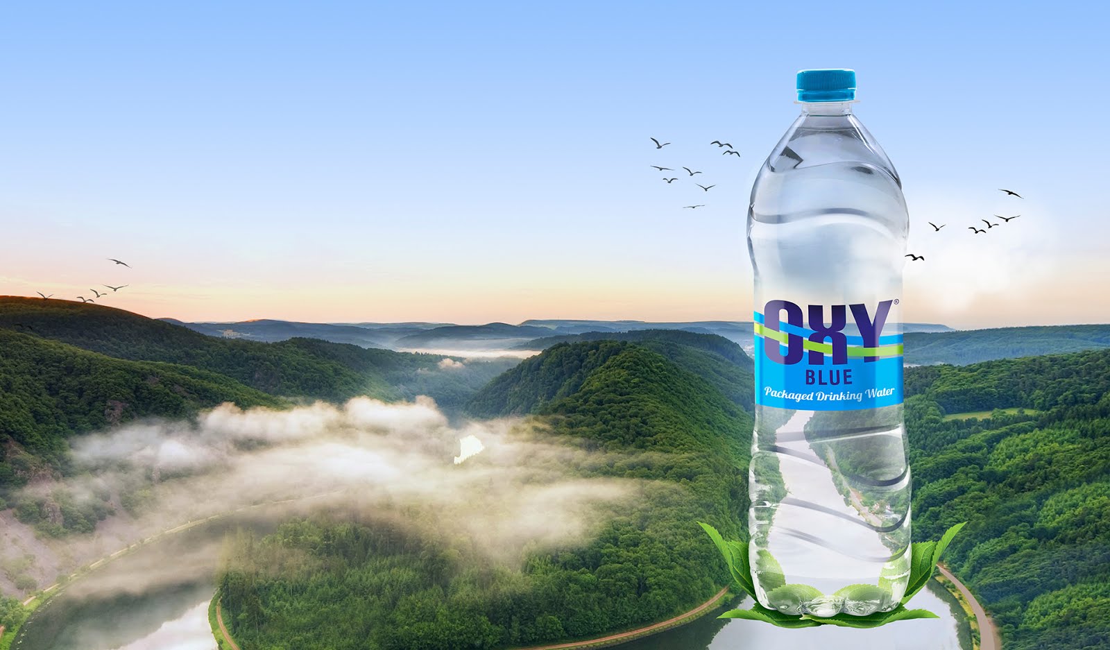
communication. In part one of the brand identity, we designed the logo quite
noticeable in the first glimpse itself. It was for the obvious reason – to be
seen in the clutter clearly. To understand it, we placed each bottles with
normally printed labels against a real background to analyze the brand
visibility and readability. Part two was the brand communication regarding its
quality and purity. Since, the water for Oxyblue is sourced from pure, natural
water from Sinhgad Valleys near Pune; we emphasized it in the communication.
THE OUTCOME
We had a firsthand
experience of ‘brand’ Oxy Blue being designed or rather brought to life by us.
It was positive, encouraging and inspiring for the entire team at Qurious
Design. The brand identity was a great success as we received feedback from the
client, distributors and even the customers. Well, it was indeed a happy,
satisfying moment for us as a creative team and a successful one too!


Any product in any segment of the industry requires to be turned into a brand. At Qurious Design, we believe the company manufactures a product which is transformed insight-fully into a brand by the ad agency. Of course, various aspects go into making a brand. It is a combination of insights, design, words and creative minds that makes the transformation successful.
THE CHALLENGE
For Oxy Blue, Packaged
Drinking Water, our team took into consideration diverse aspects prior to designing its brand identity. The local
market in the Pune region is highly unorganized given the packaged drinking
water segment. Moreover, the presence of many big and small players in this
segment makes the competition tougher. Quality of their water is poor to the
extent of being hazardous containing several impurities. In such a scenario,
introducing yet another packaged drinking water brand would mean all the same.
THE INSIGHTS
Our team studied various
local packaged drinking water brands along with some top ones. We analyzed the
pros and cons of each separately. This brand enabled us to design a brand
identity with most of the design flaws ironed out that hampers the brand
visibility in the market.
BRAND IDENTITY AND BRAND STRATEGY
For packaged drinking
water, the first impression is important. Owing to space restraint on the\ bottle
and myriad copy mandatory to be incorporated, the brand identity had to be
prominent. Our design team religiously followed this mantra while working on
the same. So our brand strategy was two-pronged with part one being the visual
identity of Oxy Blue and part two being the brand promise or the brand
communication. In part one of the brand identity, we designed the logo quite
noticeable in the first glimpse itself. It was for the obvious reason – to be
seen in the clutter clearly. To understand it, we placed each bottles with
normally printed labels against a real background to analyze the brand
visibility and readability. Part two was the brand communication regarding its
quality and purity. Since, the water for Oxyblue is sourced from pure, natural
water from Sinhgad Valleys near Pune; we emphasized it in the communication.
THE OUTCOME
We had a firsthand
experience of ‘brand’ Oxy Blue being designed or rather brought to life by us.
It was positive, encouraging and inspiring for the entire team at Qurious
Design. The brand identity was a great success as we received feedback from the
client, distributors and even the customers. Well, it was indeed a happy,
satisfying moment for us as a creative team and a successful one too!


Comments
Post a Comment